Intro
Collabify.Design is the first Uber for UI/UX designers. Our design team is originally part of the SaaS company called Glorify, we’ve set out to build the platform to help other tech companies "scratch the same itch" we've had for 3 years; accessing educated progressive UI/UX designers that specialize in robust design systems and high fidelity prototypes.
What most tech startups surprisingly are not aware of is that you can save so much time, money and energy by creating a robust design system & interactive prototypes.
Our Struggles in UX as a SaaS Company
We went through way too many iterations, if we had the knowledge we have now when we started our SaaS journey in 2019, we could've built a far superior product 100x faster. In the end we are 3 years in, and had developed so many redundant features its' gut wrenching to think about. We wrote a detailed case study about it right here.
Learning UI/UX Design Systems & High Fidelity Prototypes
It was not until we learned more about design systems, and kept up with Figma's latest evolution that we were finally able to build a super scalable design system with due processes in place for feature concept design, prototyping, testing and handoff. We are confident about everything we build now, and the entire team rally's behind the product philosophy with fierce passion. UI/UX is not just about design, it's an entire culture.
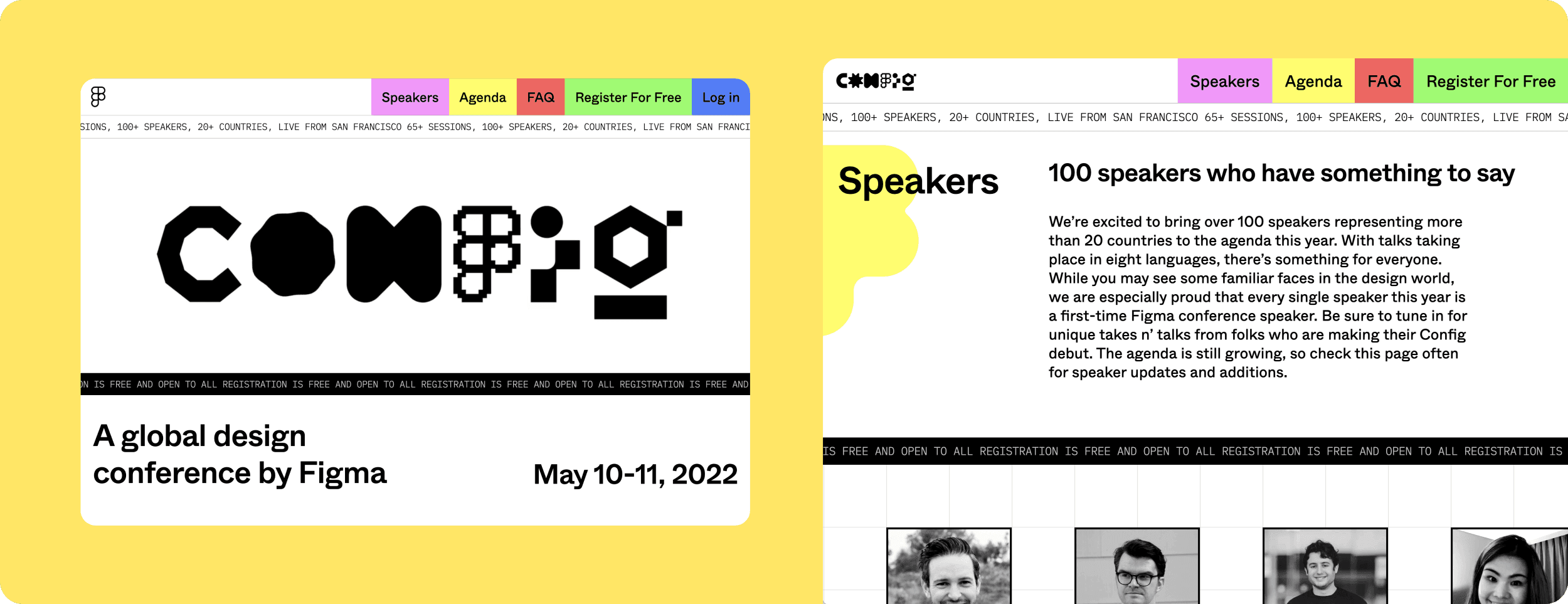
Figma Conference & New Features
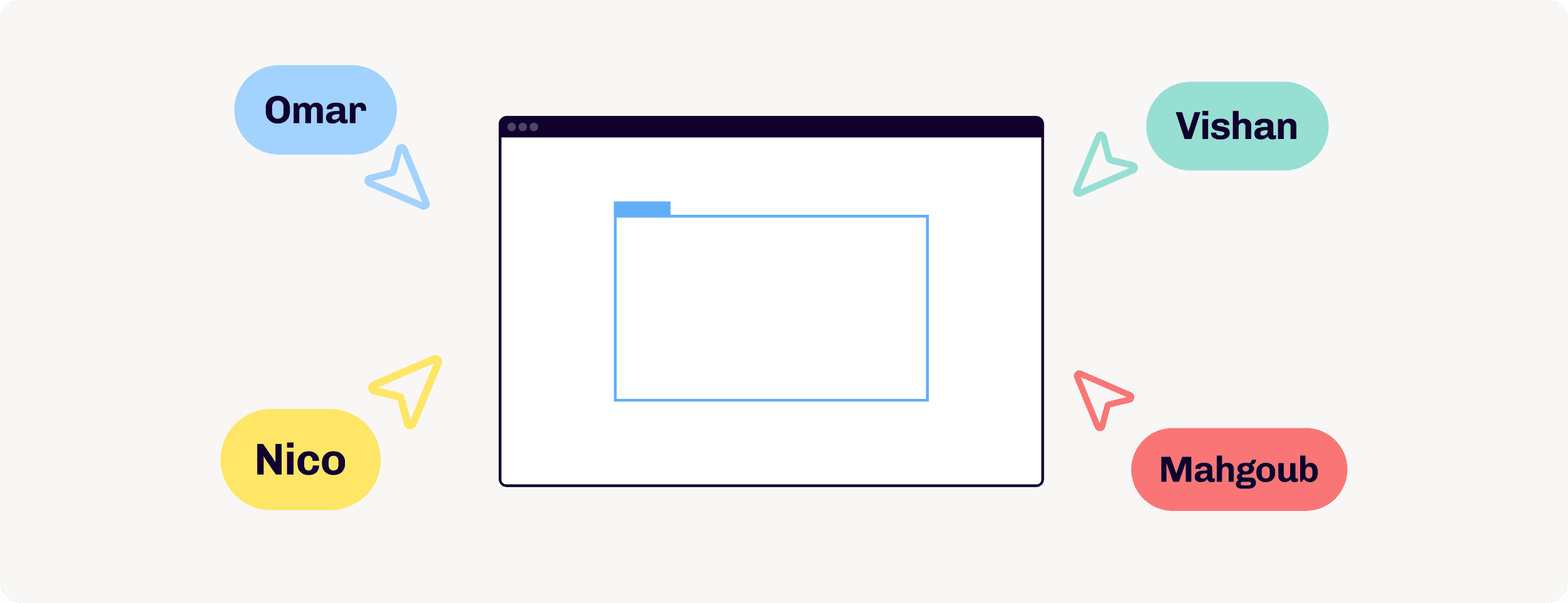
The first thing Figma solved when they started to become the go to tool for UI/UX in 2018-19, was live collaboration. No one thought about this back when people were still using Sketch before that time. But when people started using Figma, it became instantly clear how important live collaboration was in the design process.
Design became egoless.
In the past the design process through industry standardized tools encouraged a solo player approach; in your cave, confined to your own subjective thought processes with a completely indirect feedback loop.
Figma undoubtedly proved that a multiplayer live feedback loop is the future forever; where every fleeting thought gets captured, where ownership is spread beyond the one that pushes pixels, where people design together for a common goal.
Figma didn't stop there. Between 2020 and 2022, Figma has released so many new features that help you design and prototype interfaces so much faster. In the past you would need to prototype every interaction on basic elements in each screen, such as hovers and clicks on buttons. But with the release of variants and interactive components you can create the interactions just once on the component level and watch the magic happen throughout your entire design ecosystem!
Memorisely Bootcamp
We fired the agency we were working with and started to establish a strong UI.UX culture. Key members of our product and design team including myself decided to go through vigorous training bootcamps by Memorisely and Figma tutorials. We made sure we knew everything that Figma has to offer.
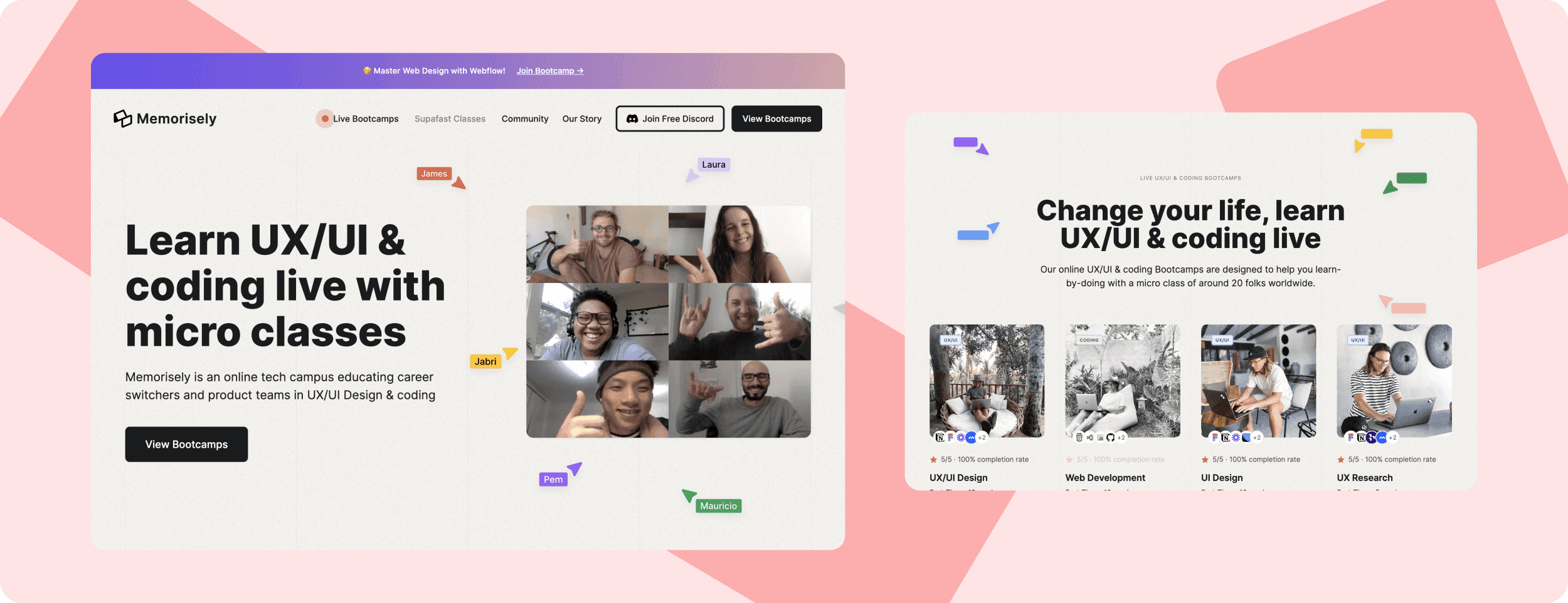
The training was so eye opening, we were able to design our next iteration of our application within weeks instead of months.
As CEO, I also designed my own concept productivity tool during my training - complete with an end to end prototype. It received so much positive feedback I decided to build it with a developer friend on the side. The prototype was extremely high fidelity that my CTO did not need endless handoff documents and skipped hours of onboarding time. The design worked like the real thing! Here's a case study about it.
Realizing Other Startups Need This!
It became clear to us now how this knowledge was helping a few of our competitors to build much better products within an unfair timeline. The culture we brought in house was so special to us, we wished we knew this much earlier, but more than anything we wished we could share this with other tech startups who are trying to ship their product from design to code with zero headache. That's when we thought about creating a platform for forward thinking UI/UX led tech startups giving them access to educated UI/UX designers on top of the latest workflows.
Building collabify.design
We called our new platform Collabify.Design. The URL is also the brand name. An empathetic word that emanates collaboration with a super high standard. The dream is skip the painful hiring process of searching and onboarding questionable candidates and get straight to work on your file with designers that know exactly what you need to build your vision 100x faster.
Branding Workshop
We brought together relevant team members such as my head of product in Glorify, COO and our new product owner for Collabify.Design, who by that time had already created an MVP and onboarded a few clients with success. We dove into a quick 1 day brand workshop. The Goal was to outline who our ideal customers were, their stories and what their pains and struggles in regards to UI/UX.
Using a timed exercise, we filled out brand attributes to understand who we were. This narrowed down to:
Collaborative, Smart and Automated.
We arrived at a few stylescapes to pave the art direction: A safe option, a bold and daring option and one that sat in between.
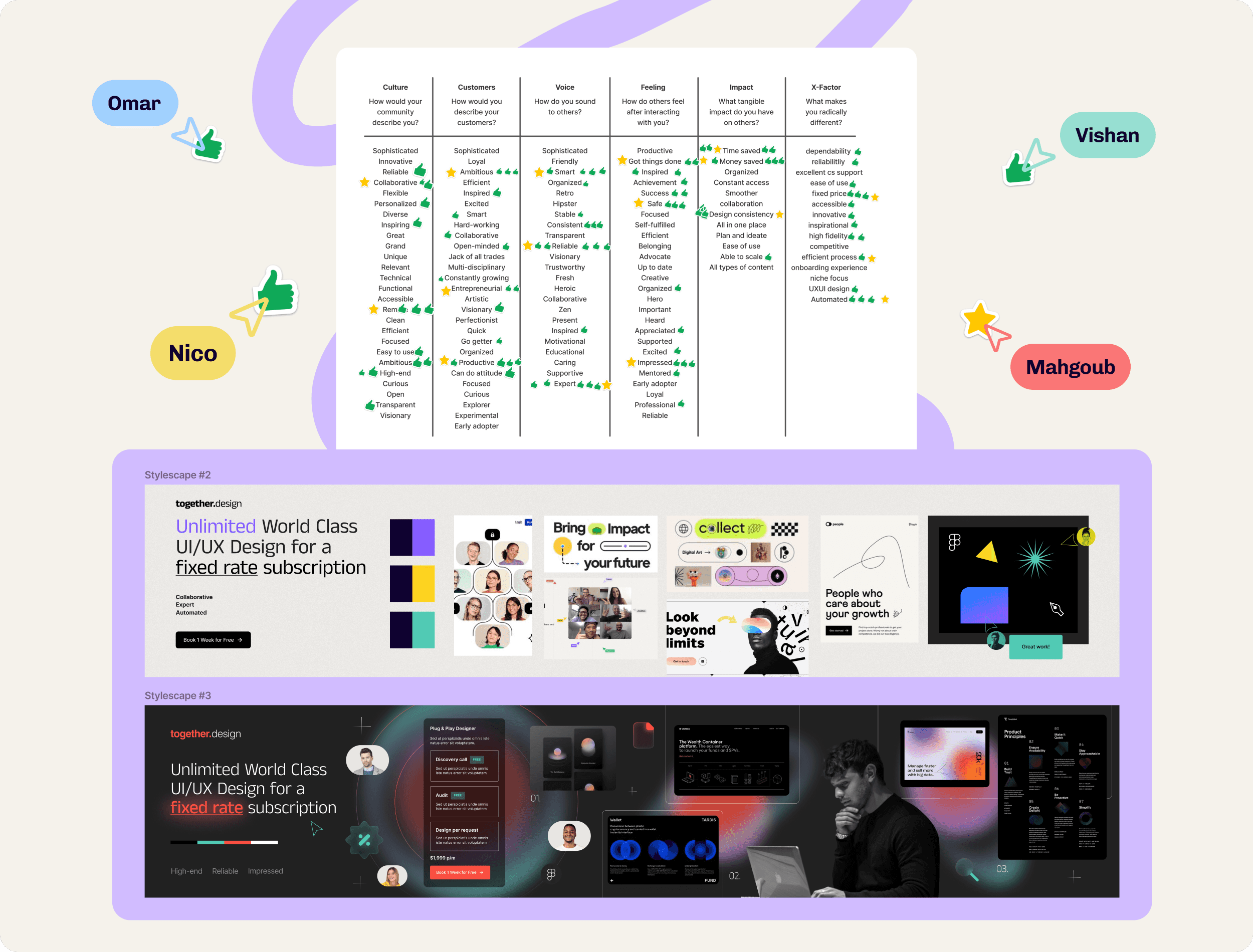
The safe version was too common.
The bold and daring used a lot of trendy gradient elements over a dark canvas. The color palette had a shocking red dressed around a techy green. Although it took the most attention, it seems way too high tech and intimating. We were looking for something much more empathetic and human.
The one that sat in between, which we called the Human stylescape was exactly what we needed. We put a poll out to like minded SaaS founders in our VC's portfolio community and as expected this got the most votes!
We did one last iteration to finalize the direction. A fun yet smart way of communicating a collaborative efficient culture through design aesthetic.
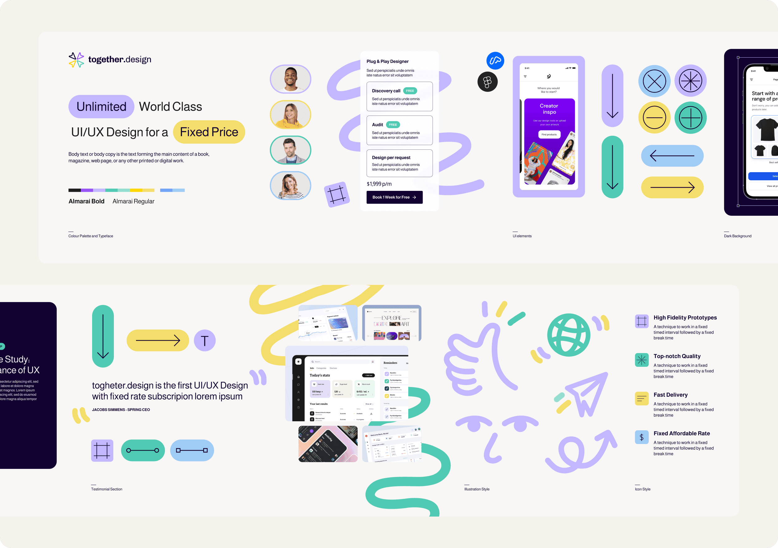
Design System Foundations
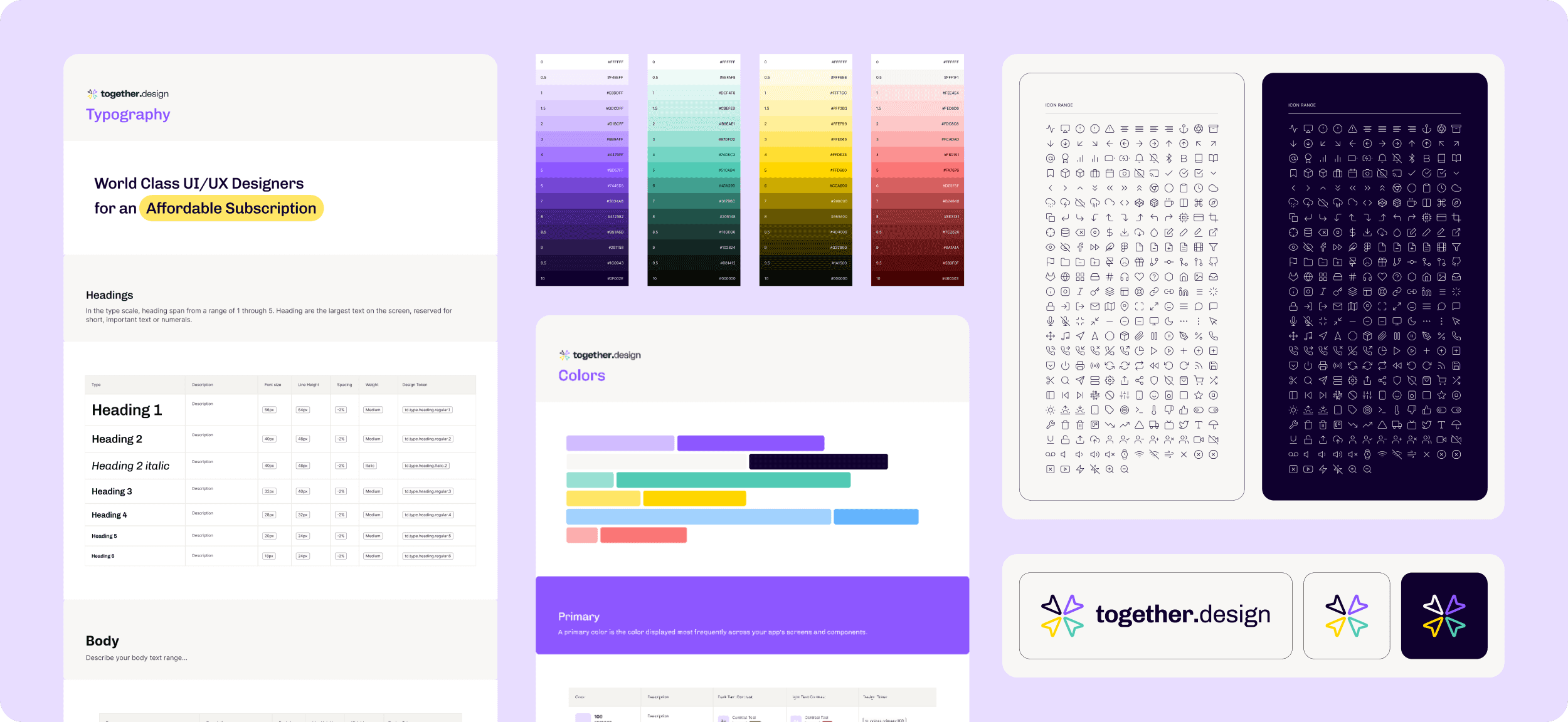
From the final stylescape we created our logo concepts, color palette and typography. We created a basic design system in 1 day which then allowed us to build our landing page within 2 days.
Landing Page Design
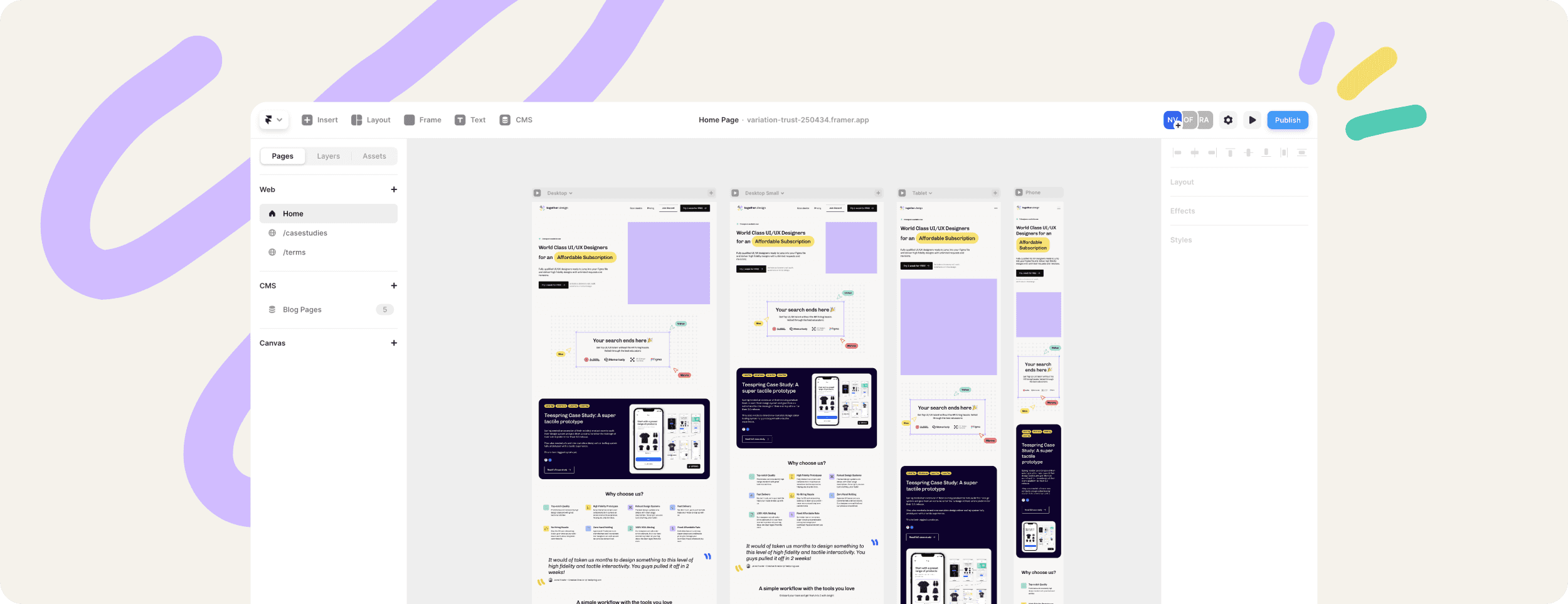
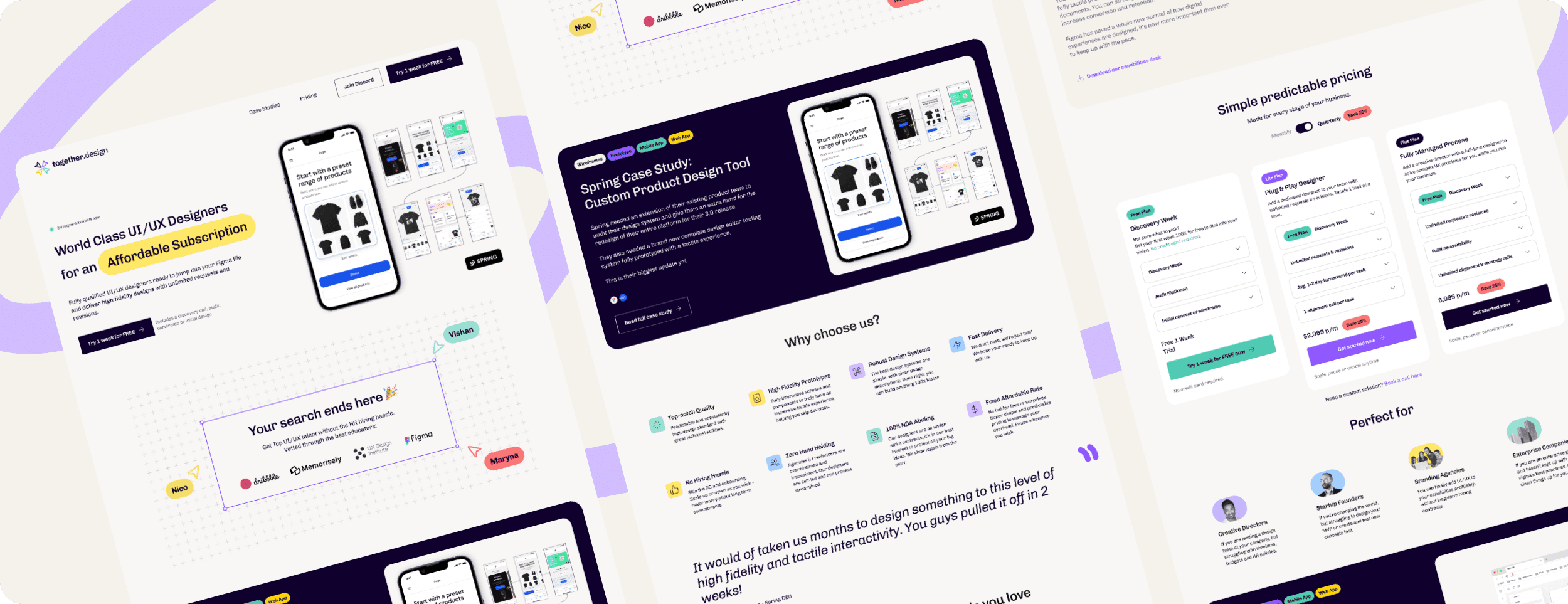
The landing page design was a breeze due to the robust foundational design system being in place. We stuck to a 12 column structure and multiple of 4px height intervals. This is the website you are currently on! We encourage anyone to explore the mobile responsiveness of the website and see how we maintained the visual impact on any device.
Building our website on Framer
One of the best ways to get your site off the ground is by using Framer. We were previously lovers of Webflow, but Framer allows you to literally copy and paste your Figma design and similar infinite canvas, polish the content, interactions and animations and publish live. It comes complete with a CMS, custom domain, analytics and your favorite integrations to launch your business website. We will most likely offer this as part of our platform's expertise soon.
