Intro
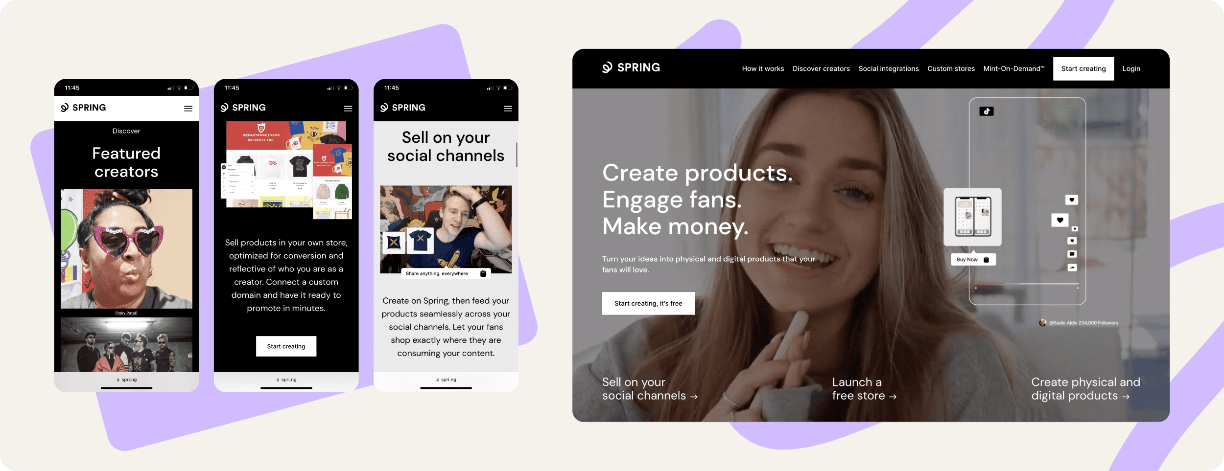
Teespring (Spring, Inc.) is an American company that operates Spring, a social e-commerce platform that allows creators to create and sell customized merch.
Individuals create campaigns in order to sell custom products on Teespring. Campaign creators are expected to design and market the product themselves. Teespring fulfills orders on campaigns that have reached a minimum sales goal (called "tipped" campaigns), and ships items to the buyers. Products are printed or manufactured in various screen-printing facilities. Teespring handles distribution of the products and customer service. Their platform offers various apparel such as T-shirts, hoodies, sweatshirts, leggings and children's wear.

Brief history
The company was founded in 2011 by Walker Williams and Evan Stites-Clayton. By 2014, the company had raised $55 million in venture capital from Khosla Ventures and Andreessen Horowitz. In 2018 Spring launched its merch shelf integration in partnership with YouTube, enabling creators to sell their products directly below video content, and expanded this business model with similar integrations for Twitch, Instagram, TikTok, etc. in the years following.
Collabify.Design Project Process
Spring needed extra expertise adding to their existing product team to audit their design system and give them an extra hand for the redesign of their Creator Onboarding to be “Mobile First”.
They also needed a brand new complete design editor tooling system fully prototyped with a tactile experience.
This was their biggest update yet.
Onboarding & Discovery
Spring's creative director, Jared Fowler, discovered us via an affiliated email campaign for Collabify.Design and reached out to us to see if we had a simple solution. He wanted to get UI/UX designers with minimum commitment and skip the HR hassle within hiring. His dedicated Account manager walked him through the process. It was clear from the discovery call that they needed 2 services to fast track their design process for their Mobile First Creator Onboarding Experience:
1. An entire design system audit
2. A high fidelity prototype for an inbuilt design tool for their merch products (without having to rely on 3rd party tools)
Jared and his product team had minimal time to spend managing the process. The Plus Plan was perfect as it included a fully managed process involving our own creative director and a full-time UI/UX designer
The Audit
All of the auditing work was fully completed within the first week. Their design system was slightly outdated and wasn't up to date with Figma's latest component variants and interactive component features. There were also a few UI accessibility challenges that were made note of.
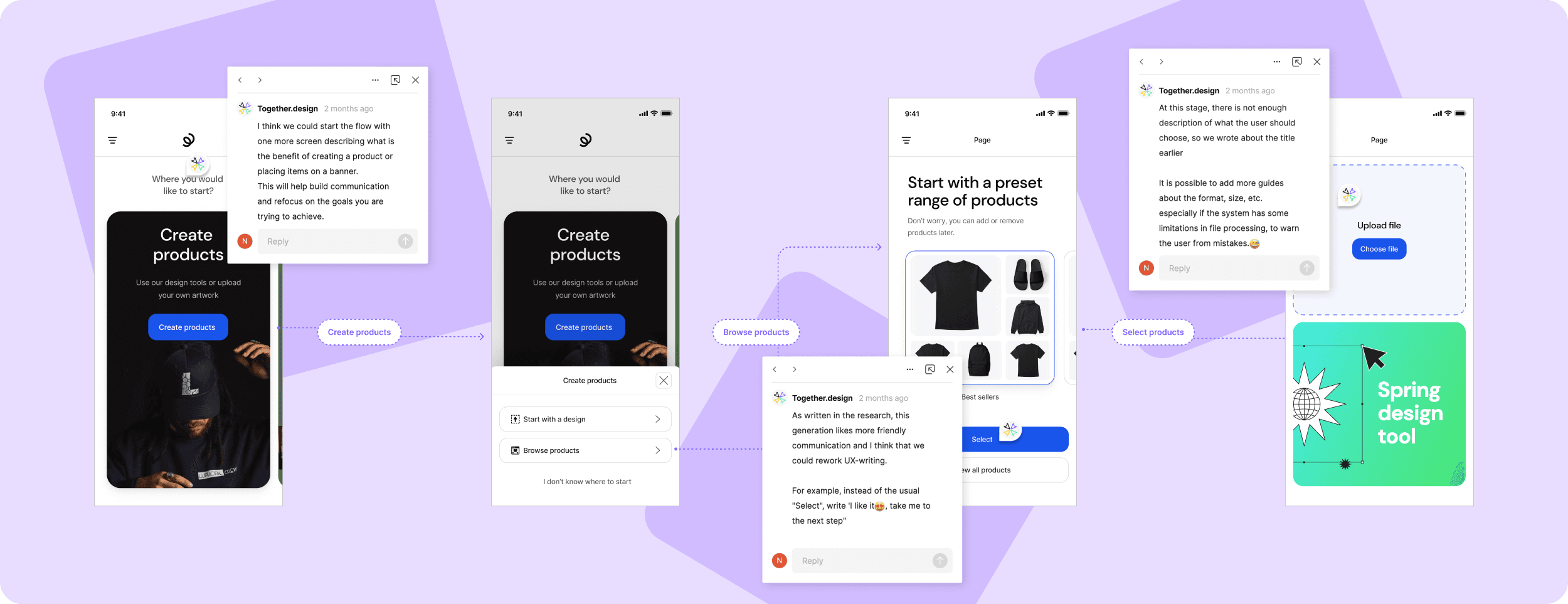
We reviewed their low fidelity screen flows of their initial Mobile First concepts and left our initial thoughts via Figma comments. This paved a clear path to start refreshing the design system and building a fresh high fidelity prototype with a fully tactile experience to bring to their stakeholders.

The prototype
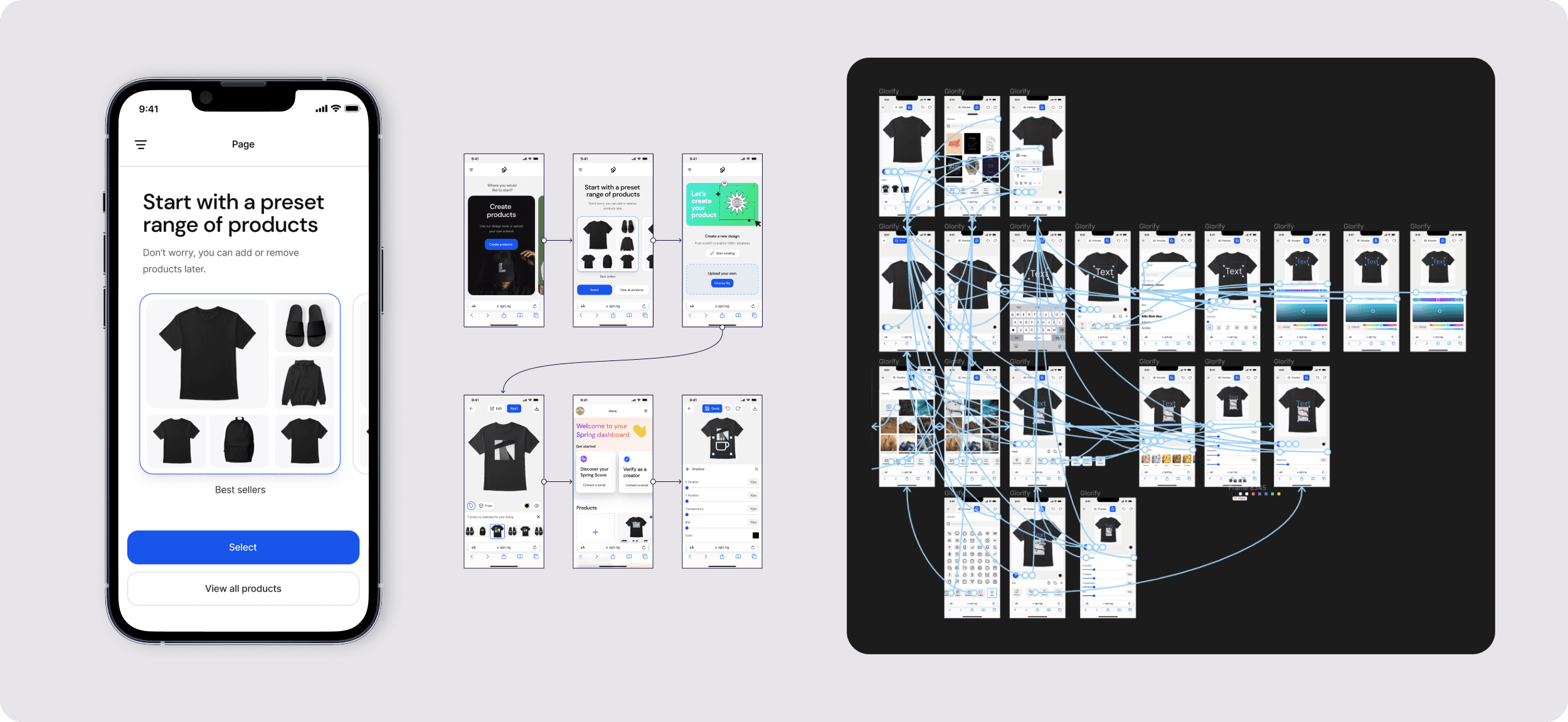
With our design team's experience building our own SaaS design tool, Glorify.com, we were already well ahead of the research process to get started immediately. We created a few rough wireframes, nailed down the basic flow and then went straight to high fidelity.
As we cleared each step and function, we created necessary interactive components to avoid repeating prototypes. It took us overall 1 week to nail all the functions and polish the final prototype for presentation.

Feedback
Jared and the team, in their own words, were "blown away". They were impressed with the simplicity of the onboarding and extremely high standards of the work. They skipped days of headache via the traditional hiring route. No fancy interviews, no scrolling through endless portfolios. They got started immediately and the solution delivered beyond their expectations.
"It would of taken us months to design something to this level of high fidelity and tactile interactivity. You guys pulled it off in 2 weeks!" - Jared Fowler, Creative Director @ Teespring.com


